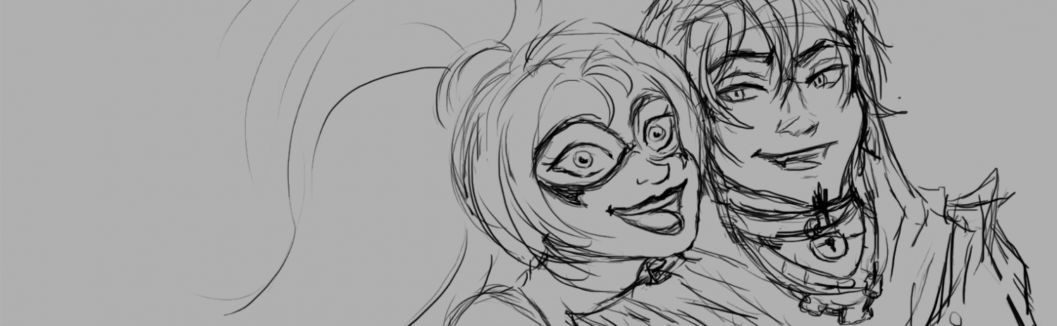
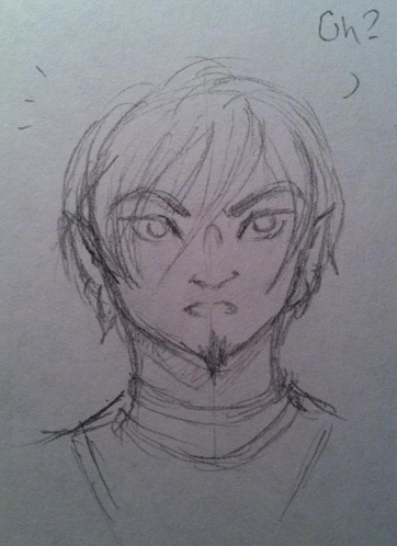
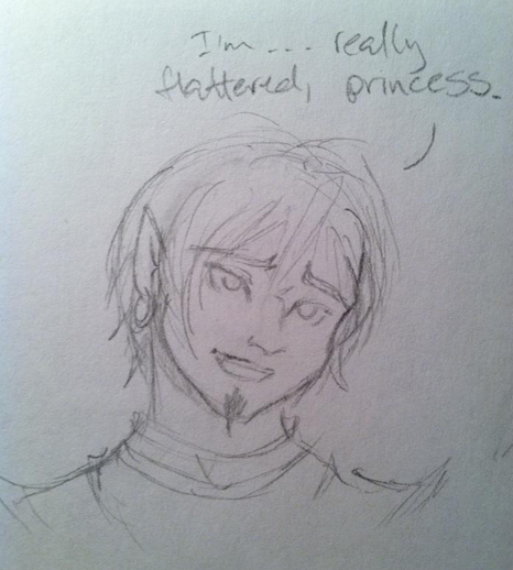
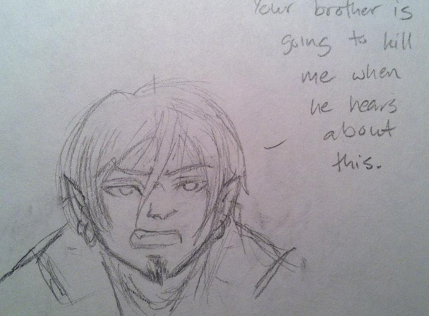
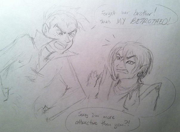
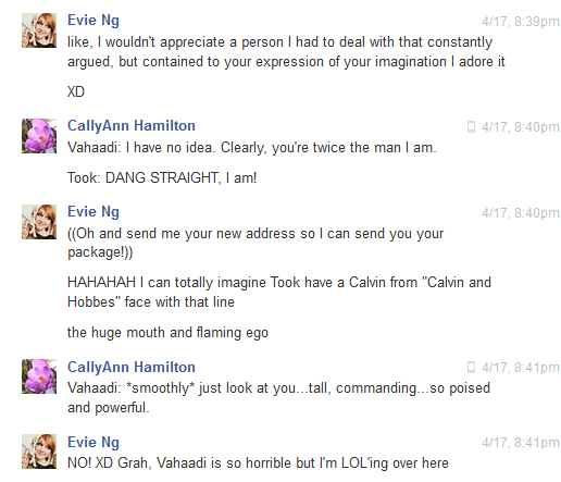
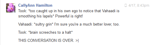
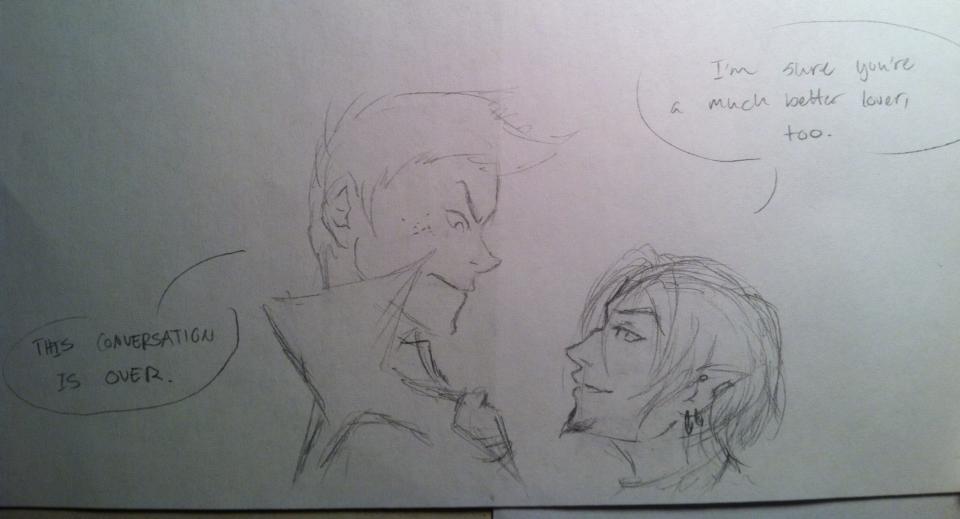
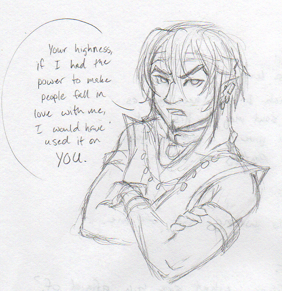
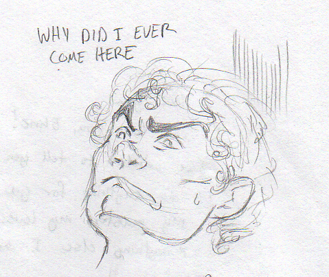
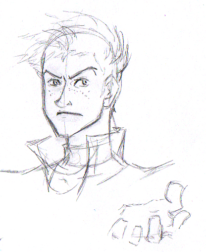
OK, I’ve said it before but I’ll say it again: Took is really easy to write, but really hard to draw. I thought I’d figured him out in these pics:
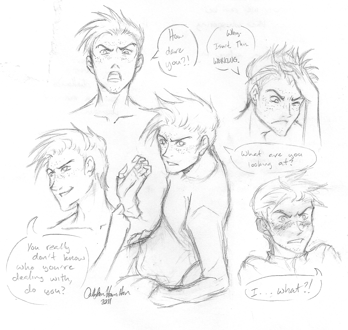
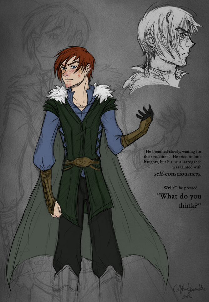
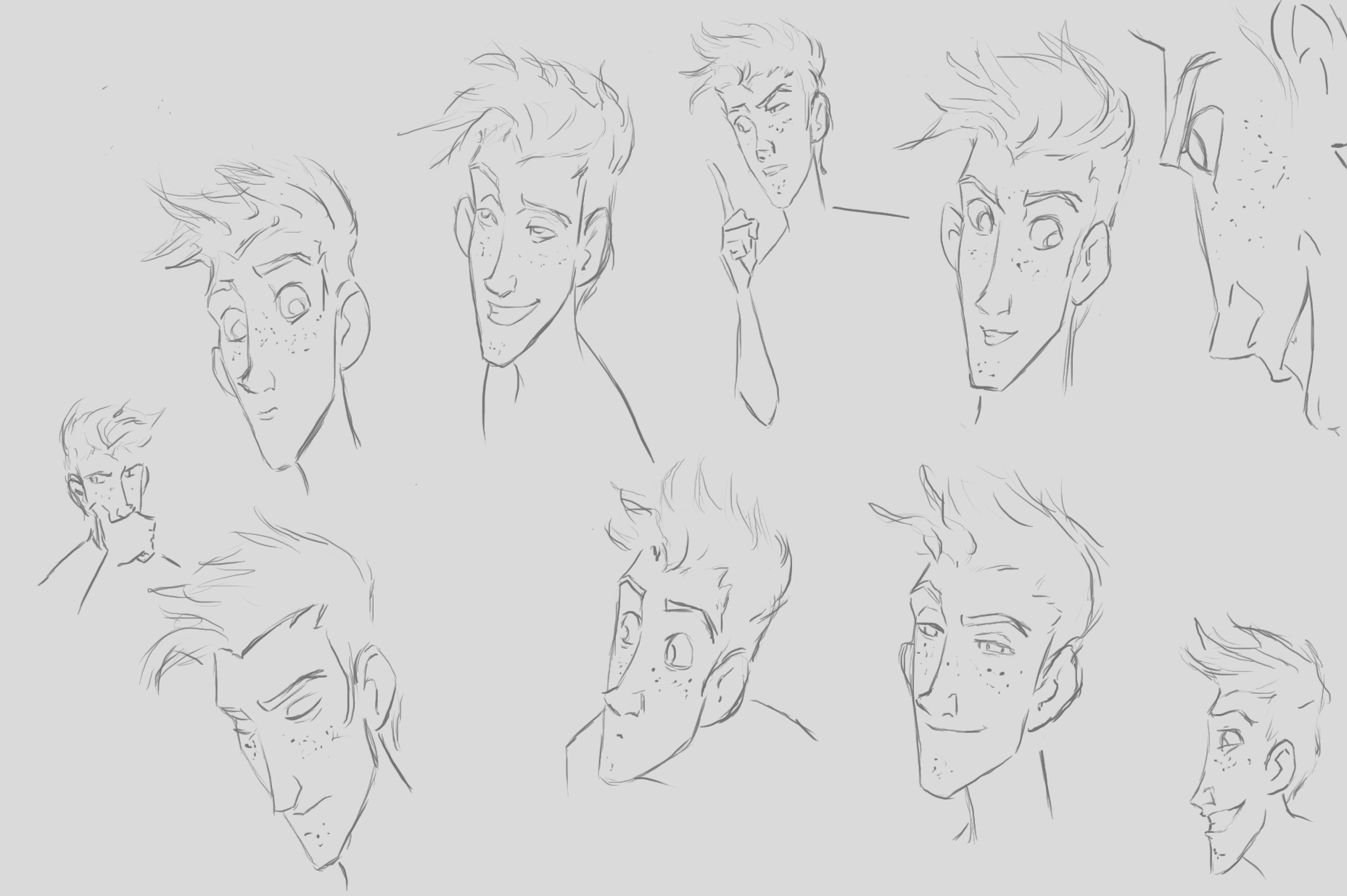
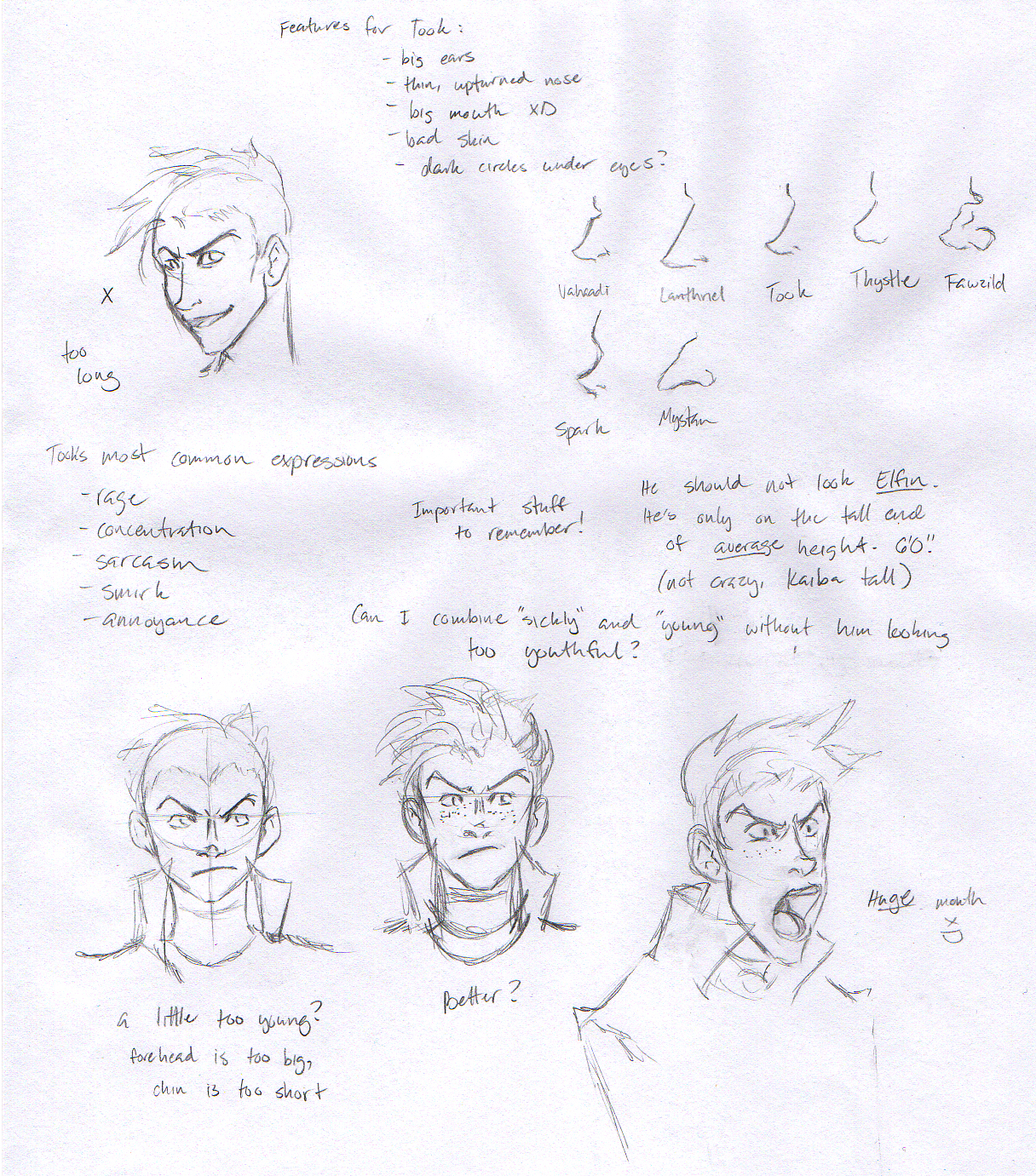
But I almost think he’s too cute??? I dunno. I was thinking a longer face might be better, since it would make him look more like Lanthriel, but Lanthriel gets his “longness” from his mom, so…uh. I’m not sure. I just don’t want him to be cute and generic looking. So here are some sketches and notes! Also, noses. The weird expression in the bottom right was me trying to explore how extreme his faces are. I think this might be a little too much but it’s funny. XD
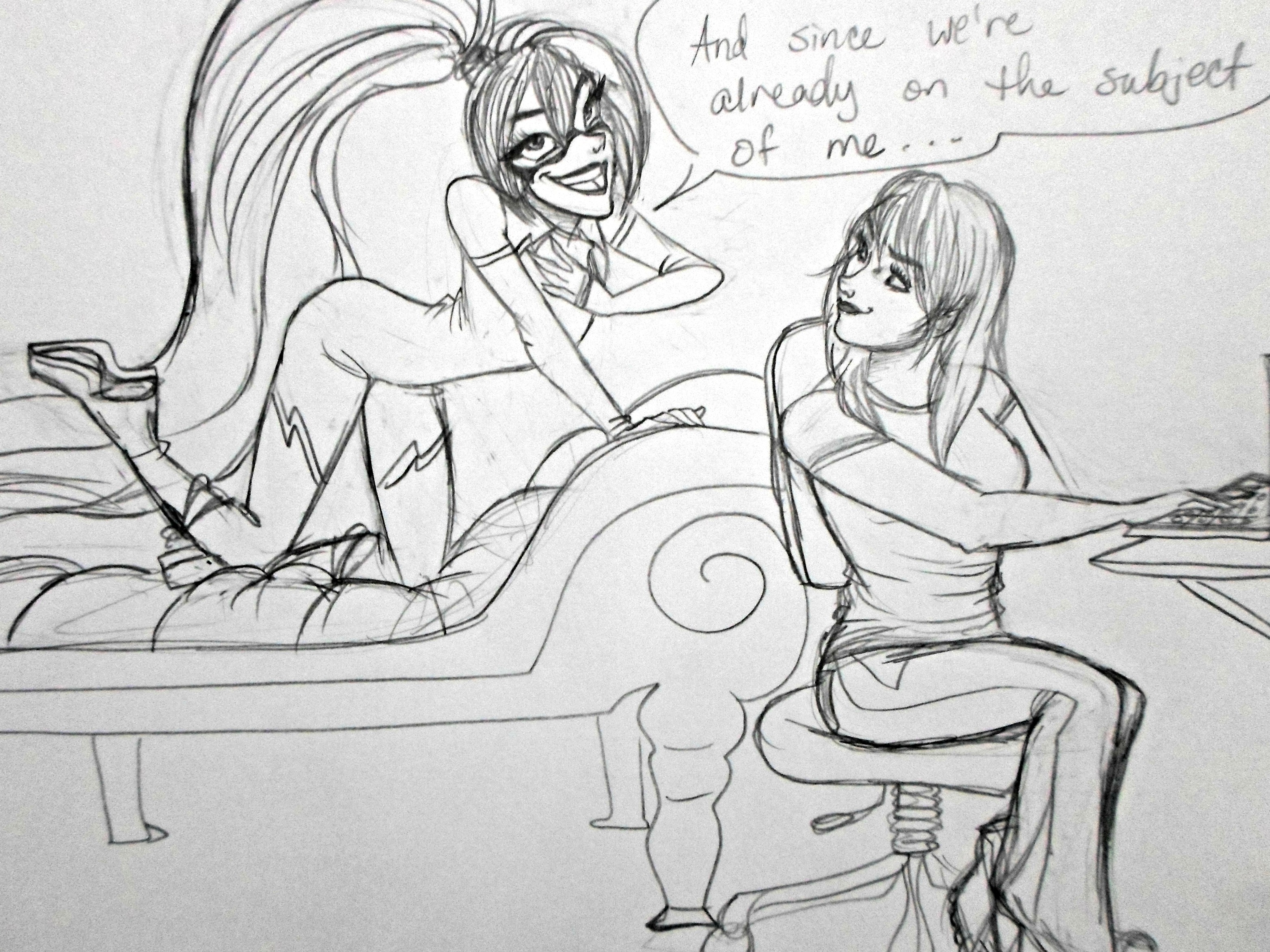
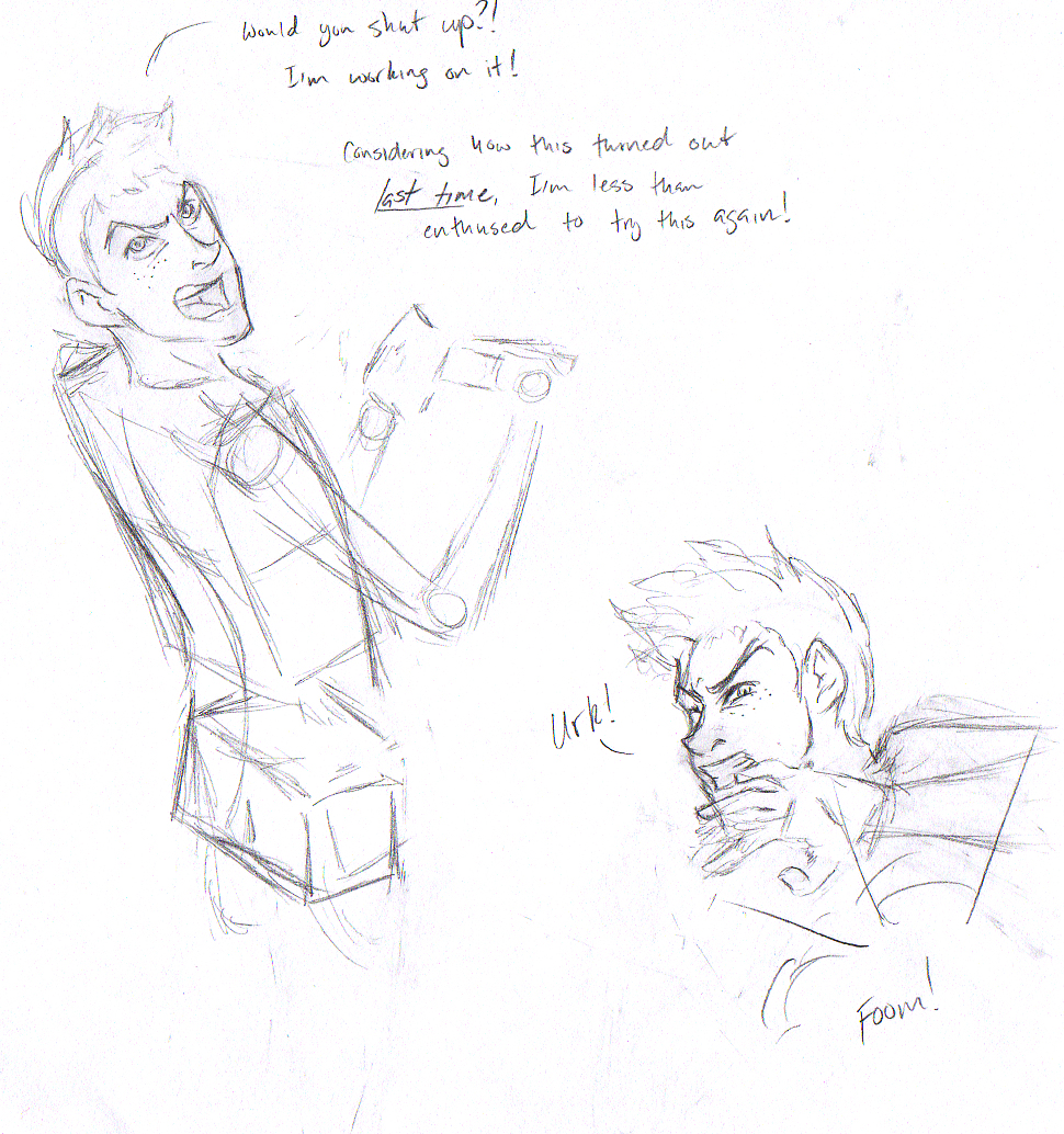
I don’t know what’s happening in this picture but I think Took is at work? He must work with other sorcerers and engineers occasionally. I didn’t really care to figure out what he was doing so I just left the first one as body boxes. The dialogue came out of nowhere.
P.S. The Took drawing for your birthday is still in the works! Right now your birthday Took has the long face look pictured above. It’s not quite as angular-cutesy as the face I gave him in the traditional study and the 2011 expression study, but he does look a little more…suave, with the long face? For what that’s worth? It used to be important to me that he looked like a teenager, but that’s not a priority to me, anymore…especially now that I’m much closer to his age (AHAHAHAHA weird thought).
I think I’d like him to have a sort of Disney villain look to him, where he’s not generically attractive but his design *works.* My problem now is that I don’t know how to incorporate the elements I’ve noticed Disney uses to “uglify” their villains (extreme cheek bones, long chins, bags under the eyes, long upper lips) without him looking WAY too old. Quandary >/