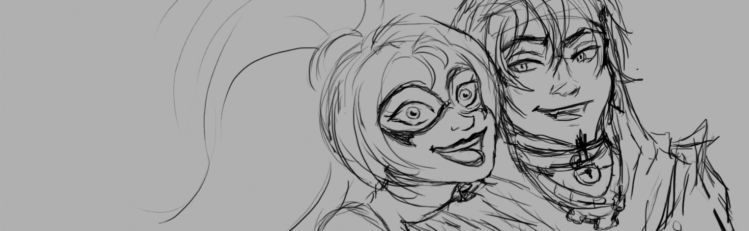
I’ve spent the last few weeks collecting and organizing art, combing through tons of references to identify elements I like and want to incorporate into my own style. I love to sketch, but I don’t know how to add color or make my pieces feel more finished/presentable.
Texture
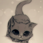
A common denominator I found in many of my favorite pieces is the use of a rough/papery/dry media texture over mostly flat colors. Shading (if present) tends to be very subtle or largely an extension of the texture. I’m particularly intrigued by the combination of this texture with a lineless style and the focus on shape. A lot of these pieces remind me of concept art you would see in animated movie “art of” books. The best I can figure, the trick to pulling off this style is having the right kinds of Photoshop brushes.
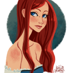
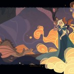
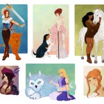
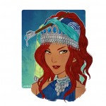
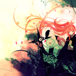
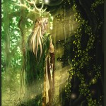
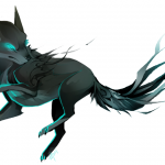
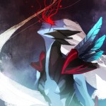
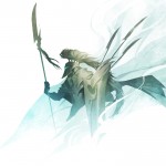
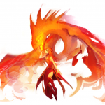
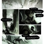
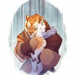
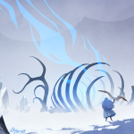
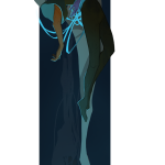
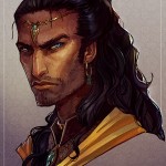
Digital Painterly (Game Art)
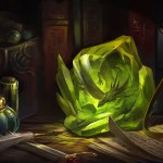
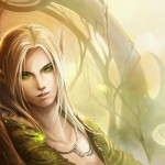
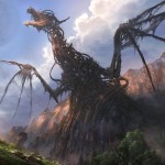
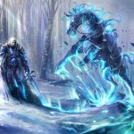
This style is one I call “Game Art” because it reminds me of World of Warcraft and various High Fantasy card games. Common denominators include vivid colors, highly detailed rendering, and lineart that is subordinated or absent. These are definitely finished pieces, not sketches, and could even be considered fine art. It looks crazy time-consuming and really difficult to pull off. I’d probably need years and years of practice and a lot more training before I could pull stuff like this off.
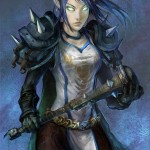
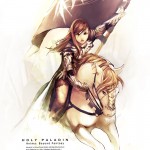
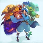
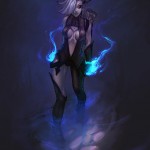
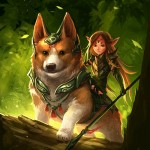
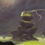
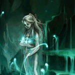
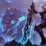
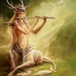
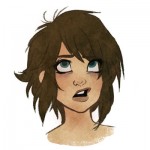
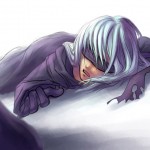
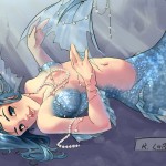
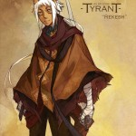
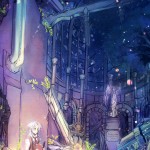
Painted Sketch
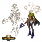
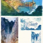
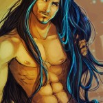
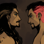
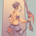
This art looks like it’s on its way to being Game Art, but the artists stopped short of fully rendering out the sketch work. It doesn’t look quite as polished as the above stuff, but part of me really likes the roughness of it, ESPECIALLY sense my drawing mind is so dependent on lines. They look like they were actually fun and relatively quick to do.
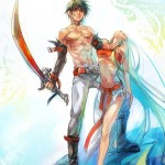
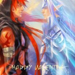
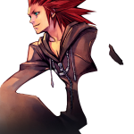
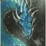
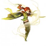
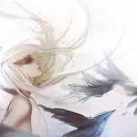
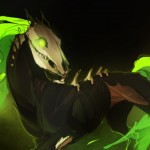
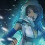
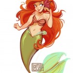
Ambient Color Pop/Gradient Wash
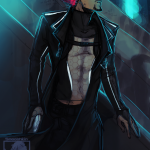
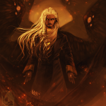
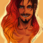
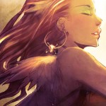
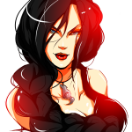
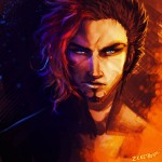
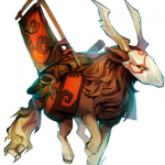
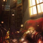
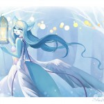
This is a style (if it could be called that) that I’ve only taken note of recently, and I LOVE it. It involves introducing an unexpected color that contrasts against the subject. It can take the form of rim-lighting, a sort of forced atmospheric perspective, or a glow. Super cool.
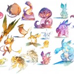

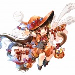
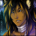
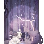
Bokeh Dots/Light Flecks
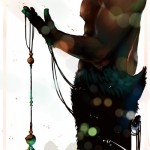
Bokeh is a technique in photography, and it occurs when you use a lens with a very low aperture. The low aperture causes only one area in the image to be in focus, and the rest of the image is softly blurred out in a flattering way. Lights that happen to be in these out-of-focus areas show up as bright disks. It creates a lovely, glittering look! Since learning this technique, I’ve been noticing that some artists render abstract bokeh-like dots into their pictures to introduce more visual interest. Even though they may not be natural or make any sense, I think it’s neat!
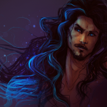
High Contrast Lineart
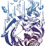
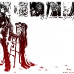
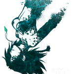
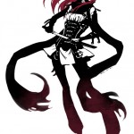
Some pieces don’t need color fill to look finished.
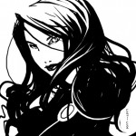
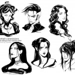
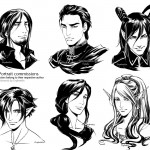
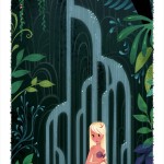
Framing and Border Ideas
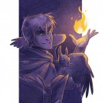
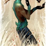
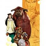
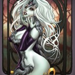
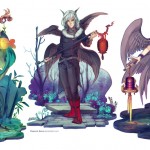
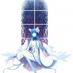
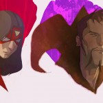
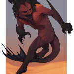
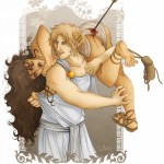
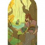
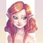
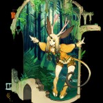
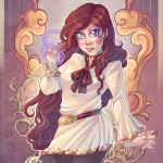
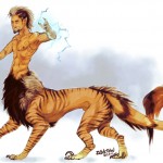
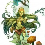
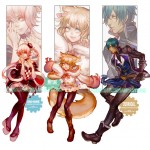
When I don’t want to include a background, or I can’t figure out how to make a background idea go all the way to the edges, it’s nice to have ideas for framing my subjects. Some of these are more complex than others. I really like frames that incorporate a suggestion of some kind of environment without including the whole thing, but abstract shapes and swirly borders are cool too!
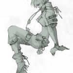
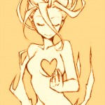
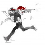
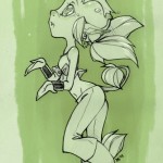
Sketches
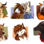
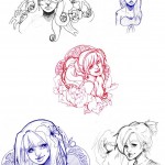
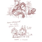
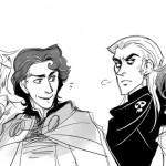
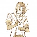
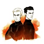
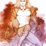
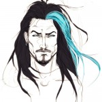
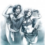
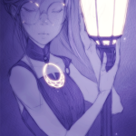
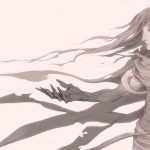
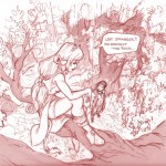
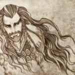
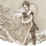
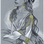
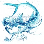
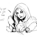
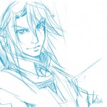
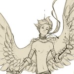
Aaaaaaaaaaaaand most of the time I’m just going to want to sketch. Here’s a dump of some sketches other artists have done that give me ideas about how to post my stuff.
Putting it All Together – ???
While I have identified a lot of things I like, I’m not sure I’m much closer to knowing what to aim for. Even among these interests there is a lot of variety. Do I like lineless better, or lined? Smudgy/painterly or textured? Does it make sense to have random bokeh dots and colors washes in everything? And even where I’m sure I want to do one thing, do I even know how? Uggghhhh.
While researching different styles, I decided to research the development of style itself. One piece of advice I found was this:
The worst thing you can do is overthink the question. Style develops naturally as you continue drawing, and partially happens on its own. It’s always good to look at other artists and see what you like about their work and see what would work in your own. Keep your mind active and see what comes naturally!
Some time ago I did make a stab at trying to combine these things, although I hadn’t thought through and analyzed what I was doing as meticulously as I have today. It was when I colored your sketch of Kairi. As you can see, I tried playing with texture, bokeh, and an ambient color pop (the bright blue rim lighting).
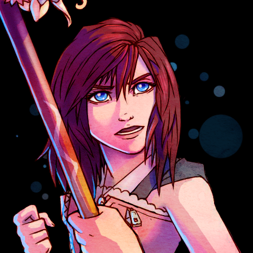
I was pretty proud of how it turned out, especially because it was so different from anything I’d ever done before. I think I’d like to keep trying to push this potential style further. For one thing, I need to draw the pic myself. XD As much fun as it was to not have to stress over getting the linework down first, I might as well continue practicing drawing while I work on coloring.
I’m definitely not going to develop my style overnight. I realize that I want to “have a style” so that I can whip out drawings faster for Sketch Dailies and this blog, but I think I’m looking at it all wrong. Sketch Dailies was deliberately created to give artists a break from drawing “manufactured” stuff for their jobs or whatever and instead just have fun and experiment. And of course, I know you don’t scorn me for not drawing a certain way. But with internships looming on the horizon, it’s easy to fall into “not good enough!”/competitive mode. I have to remember, “comparison is the thief of joy.” I can’t draw like these other artists. But none of them can draw like I do either. All we can do is keep trying–or, as I should tell myself–keep playing. 😉 Because if it’s not fun, it’s not like I have to keep doing it.
NO WONDER THIS TOOK SO LONG! This is a really concise and incredible list. I adore it. It really does reflect you. I see in each of these categories and pieces elements of your art. I think you’re already on your way to combining them all into your style! I think consistency is the hardest thing for anyone, so it’ll take time to consistently reflect all of these influences but I think defining them like this so that you have concrete examples is excellent. This makes me love and appreciate how unique your art is, and how different it is from mine! 😀 AGAIN, I want to emphasize that while I know you like accuracy, don’t try to hard to draw Spark exactly like I do. I think it’s great when you bring your interpretation to her character, and your artistic goals are super different from mine, so when you draw her, she IS going to look different, and that’s okay. Loose Canon is a team effort, so if she reflects you as a collaborator when you draw her, I like that.
Well, alright. 😉 I just don’t want you to feel like I’m hijacking her and don’t care about character integrity! D:
longest run on sentence ever and overuse of commas, I’m so sorry.
I will work on mine tonight, but given how long this took you, and you already had your ideas in place, I don’t know if I”ll get it finished.